Build your Component Library - shadcn/ui
A set of beautifully-designed, accessible components and a code distribution platform. Works with your favorite frameworks. Open Source. Open Code.
Component Library, UI-Kit
https://www.youtube.com/watch?v=V8rGgwQ-VJ0
[!info] Perplexity Query (2025-08-17T21:20:12.775Z) Question: What is ShadCN and why do developers love it so much? ### Response from sonar-pro:
- Not a conventional library: ShadCN is a collection of copy-paste-ready, reusable React components rather than a dependency installed via npm. You can copy components directly into your project for total ownership and modification. [^mrr328] [^rgkj29]
- Customization-first: Every component is styled with Tailwind CSS, making design system tweaks or theme changes effortless and granular. [^27dnkt] [^mrr328]
- Accessibility: Components leverage Radix UI primitives, so they meet accessibility standards (like WCAG) and are screen reader-compatible out of the box. [^27dnkt] [^rgkj29]
- Performance: Direct integration of only the components you need keeps your final bundle lean and your app fast. [^27dnkt] [^mrr328]
- Modern foundation: All components use Tailwind for styling and are typed in TypeScript for better reliability and autocompletion. [^rgkj29]
- Rich component set: ShadCN offers components such as buttons, dialogs, tables, accordions, forms, tooltips, modals, and more—ready to use in most modern web apps. [^27dnkt] [^c94ae2] [^v5ir7s]
!Relevant diagram or illustration related to the topic

- Total code ownership: Since you copy components directly into your codebase, tweaking, extending, or fixing them is easy and transparent—no fighting library APIs or external dependencies. [^mrr328] [^rgkj29]
- Highly customizable: Using Tailwind CSS means every design detail is easily changeable. ShadCN doesn’t force you into rigid patterns or styles. [^27dnkt] [^mrr328]
- Out-of-the-box accessibility: Built atop Radix UI, ShadCN components already follow best practices for keyboard navigation, ARIA roles, and screen reader support, reducing the burden on developers. [^27dnkt] [^mrr328] [^rgkj29]
- Choose only what you need: There’s no bloat—you include only the components you use, so your app stays slim and performant. [^mrr328] [^c94ae2]
- Smooth developer experience: Features like a CLI for scaffolded setup, compatibility with popular tools (Next.js, Vite), and support for dark mode add to its seamless integration and speed up projects. [^v5ir7s]
- Modern ecosystem integration: ShadCN plays nicely with AI-powered tools (such as Vercel’s v0) to auto-generate and fine-tune UI code based on prompts, making rapid prototyping and iteration effortless. [^v5ir7s]
!Practical example or use case visualization
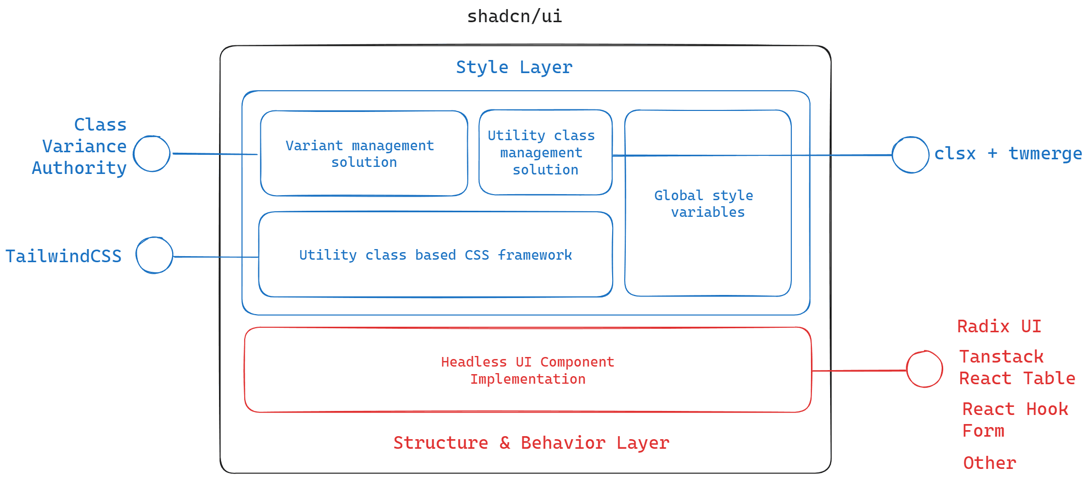
| ShadCN | Traditional UI Libraries (e.g., Material UI, Bootstrap) |
|---|---|
| Direct code copy/paste | Installed as npm dependency |
| Full source code ownership | Limited to what the library exposes |
| Tailwind CSS for styling | Often use CSS-in-JS, predefined themes, or less flexible CSS |
| Radix primitives for accessibility | Custom or library-specific accessibility |
| Pick only what you need | All components bundled, risk of code bloat |
| Rapid customization | Customization usually harder, more opinionated |
!Additional supporting visual content
- Speed: Quickly scaffold and launch fully accessible, production-ready UIs.
- Control: Developers can deeply customize components without “fighting the framework.”
- Modern stack: Powered by widely loved tools—React, Tailwind CSS, Radix UI, TypeScript.
- Community trust: Created by and for the modern web-dev community, addressing pain points from legacy approaches. [^rgkj29]
Developers choose ShadCN to skip boilerplate, retain code power, and ensure professional accessibility and design best practices from day one. [^27dnkt] [^mrr328] [^c94ae2] [^v5ir7s] [^rgkj29]
Citations
[^27dnkt]: 2025, Jul 26. What is ShadCN and Why it is Used. Published: 2025-07-23 | Updated: 2025-07-26
[^mrr328]: 2024, Dec 16. What is shadcn/ui? | Polipo Blog. Published: 2024-11-15 | Updated: 2024-12-16
[^c94ae2]: 2025, Jun 16. Shadcn UI: A Comprehensive Guide of Opensouce UI. Published: 2024-09-30 | Updated: 2025-06-16
[^v5ir7s]: 2025, Aug 17. Shadcn UI adoption guide: Overview, examples, and .... Published: 2024-05-10 | Updated: 2025-08-17
[^rgkj29]: 2025, Jun 15. What is Shadcn UI and why you should use it?. Published: 2024-09-28 | Updated: 2025-06-15
Related in the catalogue

Metriport
metriport.comOpen-Source API for Healthcare Data

An Open-source File Format API Guide For Developers
fileformat.comAn Open-source File Format API Guide For Developers

The NPM for Design Engineers
21st.devComponent Library
Overview - Dgraph
dgraph.ioThe only open source, AI-ready graph database